
Velvet Light and Painted Shadows: The Secret Language of Color in Louis XV Rooms
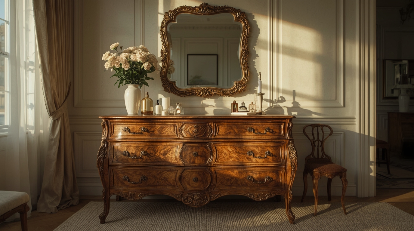
Push open the door and the air seems to soften. Light does not simply enter a Louis XV room; it is seduced, filtered, coaxed into a kind of velvet. Gold trembles along carved moldings. Silks inhale and exhale pale blues and bruised roses. Somewhere, in a panel of boiserie, a painted bird pauses mid-flight. A Louis XV interior is not just a space. It is a theater of color, composed to direct your mood as deftly as any playwright directs a scene.
Things happen in these rooms, with color. It is never innocent there, this palette. It salutes the visage, champions her conqueror, leans in to the promise of ecstasy and threat. It is the outlawed tongue of the inside, the interlayer between veneer and signifier, blistered, tony, pouting, sable, emerald, cloisonne, argent. When you entered, you got a page from its page, from eyes or lime, from yournotâ , yourreadâ.
Can You Name the Masterpiece?
Ten masterpieces. Ten questions. How well do you know the history of art?
Why is it this palette so faint, so scent-filled, so seemingly delicate that continues to enthrall the modern mind? Because of the magic of the pigments’ interactions in space and in the mind. Louis XV rooms help us understand how color can be bossy and bashful, cloying and compelling.

The Pale Drama of Light
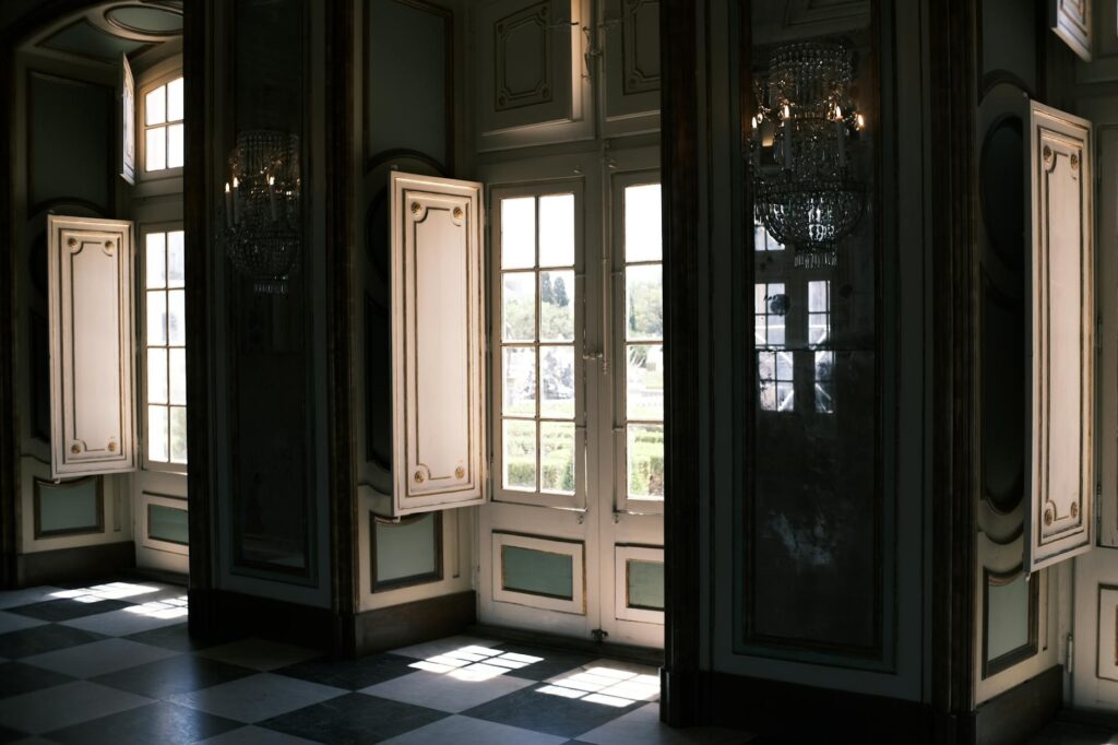
The first sensation is softness. Not the softness of fabric alone, but of atmosphere. Louis XV interiors perfected what might be called “diffused elegance”—a way of catching light, bending it, and returning it as a luminous mist.
Walls in these rooms were seldom flat planes. Carved boiseries—floral swags, shells, scrolls, arabesques—were painted in layers of creamy whites, greiges, and delicate pastels, then burnished just enough to let light break and scatter across their surfaces. This was not brightness; it was suspension. Light hovered.
Can You Guess the Artist?
Three clues. One artist. How quickly can you identify the painter?
The core colors of this world duck-egg blue, powdered rose, soft celadon, milky ivory the colors that wore the day, were selected for their behavior in daylight. Morning stroked them like silk; candlelight loved them, reluctant to release them. For a time before electric horridness, color had to dance with the flame. The well-known “salon colors” of Louis XV are not simply beautiful, they were designed to love the candle flame, and to turn each flame into a tiny, flattering sun.
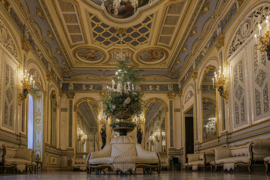
Psychologically, this soft-focus color palette pulls off a defiant act of quiet rebellion by smudging the edges. You inhabit a space in which the floor is painted circles, the shadows have been softened, the corners of walls have retreated from view. It is a kind space a tender space, perhaps, for the face, but also for feeling. You don‘t stand in these spaces; you float through them.
We are used to the idea of power as a knife edge or deep shade, a dark wood or a vivid hue. And yet we found power here disguised by mist, in poems of breathing or blurred outline. It reminds us: power can be velvet-handed and so can color.
The Sky Indoors: Blues as Perfume, Not Statement
Louis XV blue is not the blue of the Mediterranean or of naval uniforms. It is the blue of silk ribbons, of porcelain glazes, of sky remembered rather than witnessed. Often hovering between grey and green, these blues were less a slice of nature than an idealized, powdered version of it. The same blue that graced Sèvres porcelain would reappear in wall hangings, gilt clock faces, embroidered upholstery. Continuity was part of the spell.
Blue in these interiors seemed almost a fragrance: subtle, unannunciated. It surrounded you. Even when overpoweringly turquoise, it was made delicate by whites, contained by shadows, gilded in daylight. Its coolness was filial: A call to recline, to be far, to an educated gloom the 18th century secretly devoured.
This is a psychological masterpiece. Too much red or orange in settings meant for discussion, seduction, and precisely conceptualized game would be too obvious; it would be too hot. But blue, speckled with gray or hinting toward green chills the atmosphere just enough. It hints: this is where you‘re meant to talk about desire before succumbing to it.
And the contemporary eye continues to linger over these colours, for they are a luxury without noise. They coo of calm, but also come laced with that tiny echo of time passing. No wonder designers still eye up “French blue” paint samples in anticipation of catching that exact quality of peace and desire.
The Intimate Drama of Pink and Rose
If blue is atmosphere, rose is skin. Louis XV pinks rarely roar. They bloom. Think of the inner petals of a peony, of worn ballet slippers, of cheeks warmed by candle heat and champagne. The era’s fascination with the face—the art of the complexion, of cosmetics, of controlled blush—was mirrored in its interiors, where pink became the color of curated intimacy.

They were not sweet pinks, even if they sometimes had notes of beige, of grey or of mauve. They had a subtlety, like trying to put a name to what you feel. On a silk damask or on a painted panel, rose could go from innocent to sinister in one shot. Absent gilding, it appeared warm; next to blue, it sounded risqu; beside green, almost nostalgic.
The symbolism wasn‘t delicate. Lounges, boudoirs, dressing rooms all of the area‘s association with private indulgence tended to flirt with pink. But underneath that flirtation was something more: a recognition that feeling life isn‘t primary color, but a series of odd, delicate mid-tones. Rose was the color of the in-between.
Today, with pink bouncing back into interiors with a dusty, ‘grown-up’ feel, all the internal echoes are there. We name it ‘blush’, ‘nude’, ‘old rose’. But what we‘re really gunning for is the Louis XV paradox – a color that is a little soft, a little knowing; romantic, but with a slightly smirking insouciance.
Gilded Edges: Gold as Sun, Frame, and Mask
Gold in a Louis XV room is not about opulence alone; it is about choreography. Applied to carving, clocks, frames, and furniture mounts, gilding pulls the eye, directs the gaze, shapes the experience of space. It is the visual equivalent of a leitmotif in music: repeating, anchoring, unifying.
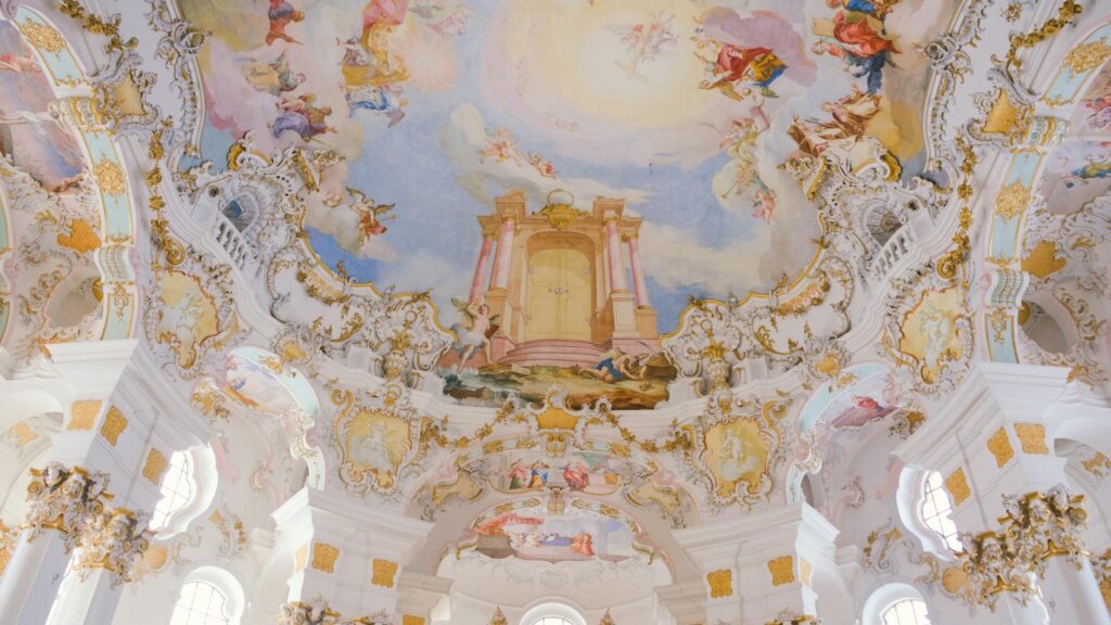
Under candlelight, gold becomes almost animate. It flickers, breathes, seems to move even when nothing else does. This mobility of gold grants it a peculiar psychological presence. You are never quite alone in such rooms; the surfaces appear to watch you back, catching your reflection in small, fractured glints.
Symbolically, too, gold had its clear parallels in 18 th century use: wealth, sovereignty, divine right. But in these interiors it also served a more delicate function: gold contained the emotion. Broad fields could be let loose, but gold held them stable. It outlined the shapes of fantasies and defined them. Rococo gold is never a flat area. It is always line, edge, prominence, concentration.
And one should not forget the aspect of concealment here. Gilding coats wood, seals joins, disguises faults. It makes the object into a mirage. To gild a carving was to give it a second skin more radiant, more perfect than the thing had any right to be. Gold, in this sense, is the color of contrivance, of the seductive untruth. And in a chamber where niceties and performance reigned, this suited perfectly.
Our modern obsession with metallic finishes brushed brass, antique gold, champagne metal is not as plainly regal, but it is fueled by the same desire: a means to capture light, to follow contours, to make the banal shimmer as if it were just a hair more real.
Greens Like Garden Shadows
Step from a Louis XV salon into a smaller cabinet painted in soft green, and you feel something shift. The room exhales. These greens are rarely raw or verdant. They belong to walled gardens, filtered through memory—the green of faded ribbons, of tapestries, of moss in shade.
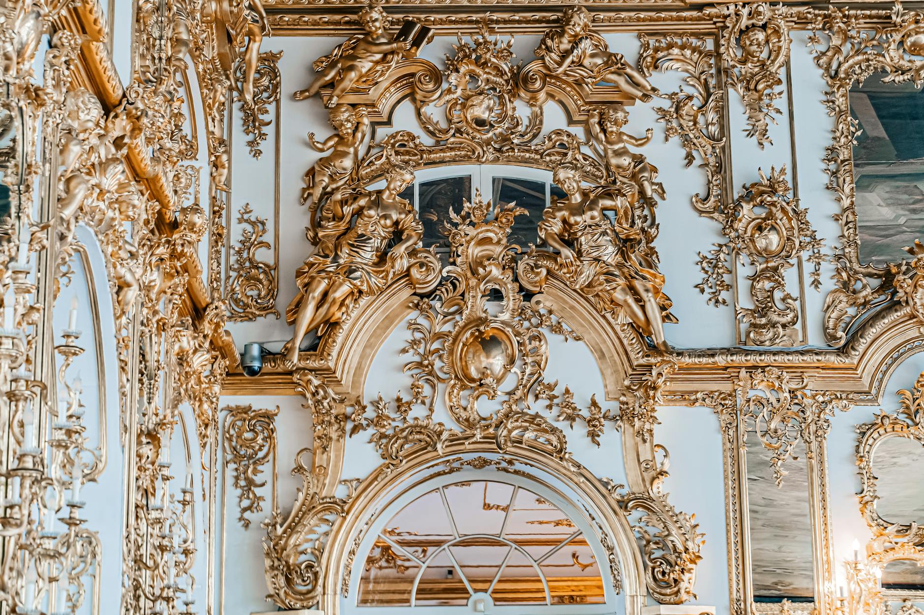
The French in this period turned nature into stage-set: manicured parterres, orchestrated avenues, trees clipped into geometry. Inside, greens continued this mediation. On boiserie, green was nearly always tempered: dulled by grey, sweetened by yellow, cooled with blue. The result was something curiously internal, a botanical color suited not to soil but to psyche.
Green rooms had layered meanings. They suggested retreat: tired eyes from killing time in the glistered room could find solace within their more muted chiaroscuro. They also indicated secretiveness. In books and pictures, forests and arbors were venues for deception and seduction. The green room was an approximation of these places: the artfully unkempt, the self-consciously secluded.
Psychologically these greens were the color of ‘reckless restraint…17‘you weren‘t out in the world, you were in, sitting in a room with carved flowers and painted leaves, in an idyllic version of nature where no one would get their shoes dirty or their reputation compromised. But the desire to be outside, for chaos, existed in the paint.18
Perhaps that is still why they hold such great appeal: they offer tranquil reassurance but also a covert opening, a hint that, in principle, you could slip away from the act, even if only in thought.
White as Silence, Not Absence
White in Louis XV rooms is easy to underestimate. It is not the stark, gallery white of modern minimalism, but a succession of soft variations: ivory, cream, stone, oyster, chalk. Often brushed over carved panelling and then gently patinated, it carries the memory of touch.
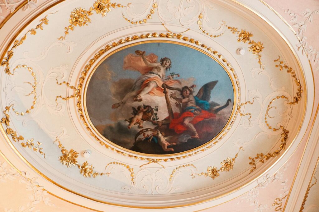
But these whites did not obliterate; they sweetened. They permitted shadows to register as if-it-was-pencil lines, that they might bring out the building. A scroll of carving took the tone of emery powder; a floral motif, that of purring. A white in such rooms is the silence among notes without it ornament chokes.
There is a psychological silence to these colors, but not an empty one. In a context thick with signification and social spectacle, white was reprieve. It gave the eye rests of silence. In a society enamored of dress, wit, and display, the pale surfaces were like a naked throat among a riot of jewels.
Importantly, those whites were seldom pristine. Ancient candlelight-, centuries of smoke-, decades of aging-, all left them lightly honeyed. Now that honey is part of the illusion. It is the hue of remembering: sugared, warm, deliberately muted. Today‘s white specifications seeking the “French white” across the quad strive for more than a color they strive for history.
The Psychology of Pastel: Soft Colors, Sharp Intent
It is tempting to dismiss the Louis XV palette as simply “pastel,” a word that has come to connote weakness, frivolity, childishness. Yet the colors of these rooms, while undoubtedly tender, were deployed with strategic precision. Softness became a medium for control.
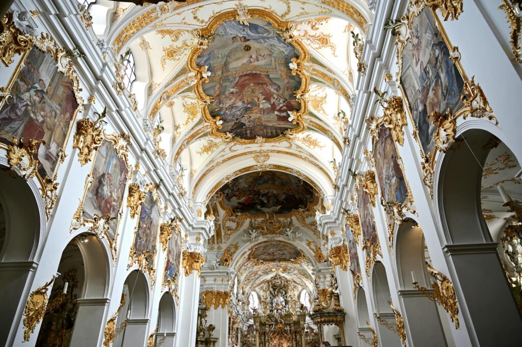
Pale colors have a curious paradox: they can be both unthreatening and insidious. They seep rather than strike. In a world where direct statements of power were increasingly unfashionable in private life, color learned to persuade instead of proclaim. The doors did not shout authority; they lulled you into acceptance.
Pastels also take poor photogenic memories. They blur. They merge into impressions rather than details and therein lies their power. People exiting these spaces may not remember the precise design of a textile, but they did remember the feeling coolness, warmth, elevation, warmth. Color functioned in terms of after-flavor.
For women who frequently ordered and dwelled in those spaces above all Madame de Pompadour color was an instrument for fashioning identity. Powdery rose walls could spoil the hue of a beloved dress; blue silk could be the border of a gaze. Rooms and bodies conversed with color. The interior was not a passive vessel; it was an offshoot of image-making.
What our obsession with these palettes tells us is equally interesting. Despite our obsession with pared back minimalist style and monochrome wardrobes, we continue to be intrigued by shots of lush, pale spaces. Maybe it‘s because they offer a nuanced insight we still long to believe in: that softness can be deliberate, that subtlety can be strength, that a space can be contradictory without requiring a solution.
Why These Colors Still Haunt Us
What endures in the Louis XV color world is not simply beauty but ambiguity. These are not pure, saturated hues. They are always something else: blue with a memory of grey, pink with a touch of beige, green with a hint of shadow. They resemble human feelings more than they resemble paint chips.
In an age of screens, where color screams at us in high resolution, the quiet intelligence of these interiors feels strangely modern. They understood what neuropsychologists now confirm: that our nervous systems respond to subtle gradations, that blurred edges calm us, that reflected light changes our perception of ourselves.
Louis XV rooms told their own inhabitants something we still need to hear: that life is richest in the tonalities between extremes. Joy and melancholy, luxury and restraint, theater and sincerity—all coexisted in those painted shadows, in that velvet light.
We return to images of these rooms, to their misty blues and burnished golds, not out of nostalgia alone, but for instruction. They remind us that color is not decoration. It is a language—coded, emotional, precise. In the play of Louis XV interiors, every hue speaks. The question, as always, is whether we are willing to listen.
AI Notice: Some visual content in this article may have been created or enhanced using artificial intelligence (AI) for artistic, editorial or illustrative purposes. Learn more about our approach in our AI & Editorial Principles.